COMPONENT 1 - Front Cover Research & Development
This post consists of my research and development for the front cover of my magazine:
MAGAZINE FRONT COVER RESEARCH
MAJOR ANALYSIS
NEW YORK MAGAZINE
New York is an American biweekly magazine that covers topics such as life, culture, politics and style, with an emphasis to New York City.
MEDIA LANGUAGE
The genre conventions of a style magazine is to include a fashion designer/model as the main image on the cover, this magazine however, conforms to that convention. The magazine does this by having an anonymous individual as a model, resulting in the viewer solely focusing on the properties of the subject, coupled with the white and plain background, it shifts the viewers attention to the bright multicolored vintage clothing of the subject - connotating fun and irreverence despite the rest of the magazine having a theme royalty and upper class, with the strict use of the white and black colors and sans serif fonts on the Masthead and the Strapline. The image is also a longshot of the subject, further enhancing the focus on the entirety of the subject.
REPRESENTATION
The magazine conveys
multiple representations to New York stereotypes. Carrying multiple, what looks to be, shopping bags, and the thick, abundant layer of clothing on the person, could portray the materialistic nature of New Yorkers. The clothing may also be a parody to modern fashion, portraying the obnoxious clothing designs created by fashion designers. Other stereotype representations like their love for the New York style pizza, which is being held on the person's left hand, and a spinoff to the word "New York", mocking the pronunciation of the word in a New York accent.
multiple representations to New York stereotypes. Carrying multiple, what looks to be, shopping bags, and the thick, abundant layer of clothing on the person, could portray the materialistic nature of New Yorkers. The clothing may also be a parody to modern fashion, portraying the obnoxious clothing designs created by fashion designers. Other stereotype representations like their love for the New York style pizza, which is being held on the person's left hand, and a spinoff to the word "New York", mocking the pronunciation of the word in a New York accent.
AUDIENCE
The target audience would be younger New Yorkers, as well as those who enjoy fashion. The casual setting of the magazine set by the representations and humor may attract younger audiences as well as those who come from New York. The clothing mostly consists of New York souvenirs which could additionally attract New Yorkers.
INDUSTRY
With more than half of the magazine's viewers being women, having the New York magazine's dedicated fashion and lifestyle publication being a women as well, Stella Bugbee, they will view her as a role model, and may be reading this magazine as a form of personal identity (Uses and Gratification).
FOURFOURTWO
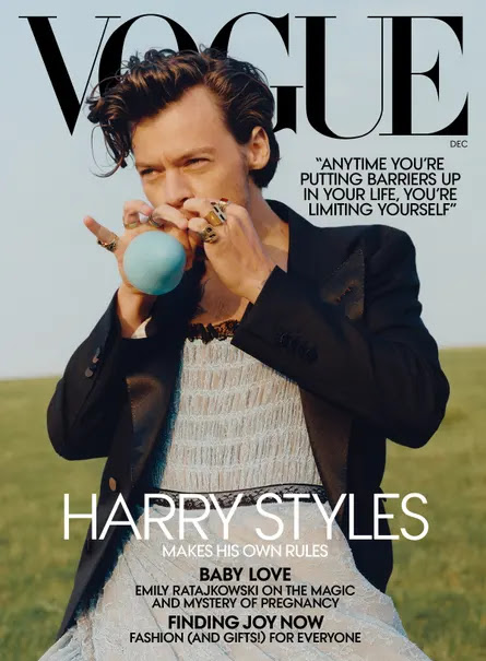
Harry Styles appeared on Vogue's December issue, putting out a bold statement on the front cover with people quoting it as a "steady feminization of contemporary males". Vogues decision on selecting Harry Styles could help them attract a wider range of audience due to the artists countless fans and followers from the music industry, and especially since Harry has been deemed as "The new king of pop", so putting the king of pop on the magazine would surely gain attention. In the cover, Harry styles can be seen wearing a dress, along with the quote on all capitals "Anytime you're putting barriers up in your life, you're limiting yourself." and "Harry Styles makes his own rules" this should clearly indicate that Harry Styles is breaking away from stereotypes and is certainly not against the idea of feminine men. The dress and the balloon matching very well with the light blue sky in the background makes it the main color of the cover, which could indicate tranquility, peace and calmness, connotating the lack of worry he has towards his style along with his casual mode of address through non-direct eye contact.
MEN'S HEALTH
Men's Health magazine shows off the traditional masculine men as being the ideal body and health for men. Unlike today, where it's often quite hard to differentiate the ideal man's physique due to newer generations suggesting that "Being Fat is Okay" or "Men are allowed to be feminine". Though this is the case for today, Men's Health subverts this change and conforms to traditional conventions, this can be seen from the main image being a lean and muscular man, losing fat being very good and seems to be the main cover line of the magazine. The mode of address is casual along with the sans serif font, which could represent stereotypes such as the ripped beach goers being cool and chill, but the low camera angle and red color could indicate a dominating and authoritative man. The puff shown on the left third of the magazine denotating an overweight and unattractive guy turning into a ripped guy could help the magazine gain attention, along with promises from the cover lines such as "Hard abs made easy" and "96 power foods for men".
TIME
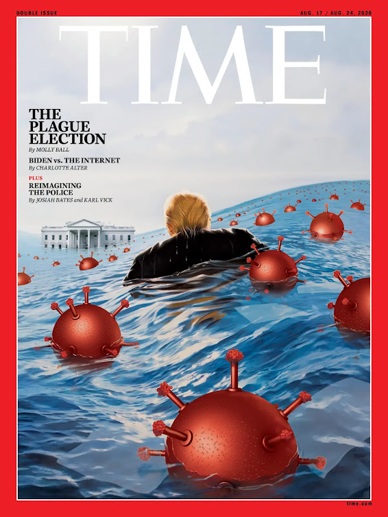
The magazine depicts former US president Donald Trump, on the troubles he faces during the 2020 president election against Joe Biden during the COVID-19 pandemic. The magazine was the August 17 and 24 issue which was Tim O’Brien's 4th installment on Trump, which mainly focuses on telling a story through his covers. From a regular standpoint, the magazine denotates Donald Trump floating on an ocean filled with the Corona virus, with the white house being seen in the distance, half flooded. The image is a metaphor on the troubles he has as a president, trouble "staying afloat", with the virus representing naval mines with the color red indicating danger, the high tides threatening to engulf the white house, indicating that his position as president would be gone, and being in the distance meaning that it's too far to reach for Trump.
TEENVOGUE
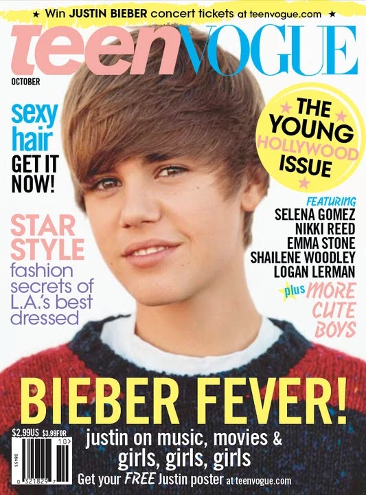
TEENVOGUE released it's October issue with Justin Bieber appearing as it's main image, this magazine focuses on star appeal, teenage fashion, and gossips. The direct mode of address fits to this magazine as the target audience would surely be teenage girls, which could connote a "relationship" between the star and the reader. Brighter colors like pink, yellow and blue, along with it's sans-serif typeface, this is much more casual when compared to the original Vogue magazine, this is done intentionally as once again, it would be able to fit it's target audience which is teenage girls. Words like "Sexy", "Cute", "Star" are found more abundantly in this magazine as that's what the target audience is attracted to, in this case more specifically are Bieber fangirls from the ages of 12 - 17.
HOOP
HOOP magazine published a magazine with Dwight Howard, as the main image of the cover. This magazine portrays him as superior but also chill, this can be seen through the camera angles and face expression. This magazine uses sans-serif font, which would fit with the tone of the face expression, as well as the well lit and earthy color scheme.
MAGAZINE FRONT COVER DEVELOPMENT
After researching and brainstorming ideas, I decided that my magazine will be a sports magazine, I would prioritize the topic to basketball as basketball is very popular in my school. I will also be featuring new of sports in my school specifically, like a school magazine but the one I will be making will specifically target sports, though I will mention that the magazine can feature other topics through skylines.
I've compiled names for the masthead of the magazine, which would not only fit to one category of topics but ensures that it can fit to many categories such as sports, life, news, health etc.
POSSIBLE NAME IDEAS:
- REGENTS Paper
- STUDENT Exp
- SWEAT
- HYPE
- REGENTS Hype
- LOCKER
- SPORTS LOCKER
- FULL TIME
- HALF TIME
- FINAL WHISTLE
- REBOUND
- ADDED TIME
For the name, I decided that Hype will be the name for my magazine. This is because I want my news to be exciting and a mouth opening magazine. And so to fit the name of my magazine, the magazine itself will be exciting general news, but this one will specifically target basketball.
These are some of the sketches I did to visualize my magazine, some were called Regents Hype because that was my initial name, but then changed it to just HYPE to make it more appealing and broad.
This sketch is what I've decided to do, the magazine will have either a basketball player in the middle, or the coach in the middle, which then could alter the interview, either an interview with the player or the coach. If I were to interview the player it would be more casual and chill, topics could include experience, journey, tips etc. and for the coach it would probably be more serious and discuss the team performance or overall ranking.
The decision I've decided to do is to interview a player. This is because the name of the magazine will be HYPE and so a casual and chill tone would fit better for a topic. The player will hold a ball against his body in his right arm and looking straight onto the ring, this connotates an obstacle or a challenge faced by the player. The setting will be around the afternoon to make sure there is still sunlight but not too bright, this is because the location I'm going to use is outdoors. The background will be the sky and blurred, the blur helps the viewer know where to look and notify the main subject which is the player and the ring, the blur helps the visibility of the headlines as well.
Here are the candidates for the masthead design for the magazine. I tried to include the color red to symbolize passion and enthusiasm and tried to avoid serif fonts to make it look more casual and less formal.
Here are examples of them used for the magazine (picture taken from internet as reference):
Here is what my magazine's cover would look like:
Here is the design for my magazine cover. The main genre and topic of this magazine will all be about excitement and hype, thus the color being a shade of red, orang and yellow as well as the sans serif typography to make it more casual. My main coverline would be located in the bottom left covering an interview with a basketball match MVP, with other coverlines located at the right side of the magazine. I've added two pull quotes onto the cover both expressing hard work and high spirits.


.jpeg)


.png)
.png)
.png)

.png)


Comments
Post a Comment